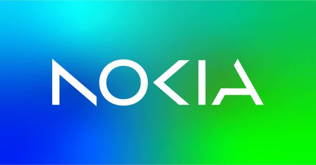
Nokia, a telecom equipment manufacturer, has announced a brand identity overhaul for the first time in almost six decades, as part of its pursuit of aggressive growth. The company’s new logo features the word NOKIA made up of five different shapes in a range of colours, replacing the iconic blue hue of the old logo. Pekka Lundmark, the CEO, unveiled the new design before a business update on the eve of the annual Mobile World Congress in Barcelona.

Lundmark took over as CEO in 2020 and established a three-stage strategy of resetting, accelerating, and scaling. After completing the reset phase, the company is now focusing on selling gear to other businesses while still aiming to expand its service provider business. Nokia aims to double its enterprise sales to double digits as soon as possible, after a 21% growth in the enterprise sector in 2022.

Nokia’s expansion into factory automation and data centres puts it in competition with big tech firms such as Microsoft and Amazon. Lundmark acknowledged that there would be situations where the company’s partners and customers could become competitors.

The telecom gear market faces pressure from a difficult macro environment, with high-margin markets such as North America being replaced by low-margin regions like India, leading to Ericsson laying off 8,500 employees. Nokia plans to review the growth path of its different businesses, including the possibility of divestment.


